Was it just me, or was the uBar advert at the bottom of the title really oddly placed. It was almost as if it were going to be part of the article. How the brand was becoming associated with crap software too.
Meanwhile that was totally just a horribly placed ad for the site ...
I'm never one to judge a rebrand immediately, as so many people were quick to do here. These things have a tendency to grow on you.
But after living with the rebrand for a few weeks? It sucks, and it made me realize how all the things I used to like about Uber are disappearing.
The simplicity was one of the best parts of Uber: you picked your service level, then ordered a pickup. That was it! These days, they've added a lot more friction to the process, and instituted carpooling rules. Never mind that surge pricing is almost always in effect -- I guess they're having a hard time retaining drivers?
Ultimately, all Uber has long-term is a brand: their business model will be commoditized the day autonomous cars are integrated into a fleet management system. And they fucked up that brand: they went from a recognizable brand identified with the letter "U" to an unrecognizable glyph that looks more like a video game than a ride hailing app.
For the record, it's happened more than once now that I look through my app menu and see the new Uber icon and have no idea what it is. Takes me a second to think about it and remember this 'rebranding'.
It's one of the worst things they could have done at a time when they need a strong brand the most.
About two weeks ago, I found myself in Manhattan, needing to get to a specific airport hotel near jfk for a 7am flight. I'd never used Uber before, so I downloaded the app - I knew nothing about the rebranding (which had happened at the time) but I found myself with a somewhat bewildering array of options - uber, uberx, uber black, uber pool, something else. Multiplied by choosing the type of vehicle?
I had no idea what I should choose and I was in no mood to track down what to the designers and implementors meant by the various choices in the matrix.
(Took the subway to something close, got out, got in a cab and got there for $20 total)
I wish there had been a more scripted experience: where are you going? What's your timeframe? Do you have luggage or need to impress someone? Do you mind acting as a carpool dummy? Do you want conversation or quiet?
Then pick from your array of checkboxes for me.
Basically, designers have to put up with the same management bullshit as developers, except with significantly less respect for the difficulty of their craft.
All they needed to do was rotate the icon 90' clockwise and it would have satisfied everyone.
--EDIT-- For clarity: http://imgur.com/sZN6g2i ...still looks like a 'U'
I really hope the writers of Silicon Valley somehow work this into the show.
Unfortunately Uber's timing is such that it'll probably have to be season 4.
Just wanted to say that Uber is used by the mass; It's not really a product for techies. So a lot of my friends thought that Uber has been deleted from their phone (as they weren't able to find the icon) and then went ahead and ordered a cab from the competitor.
Am I the only one that sees the icon and thinks that it looks like an abstract drawing of the sphincter or the underside of your anatomy? Must be tortured remembrances of goatsee videos from years gone by. Perhaps there is a tie in with all those grindr ads. Personally I find the combination of moms, puppies, and sphincters a bit disturbing.
I've never, ever in my life seen a rebranding or redesign that wasn't widely complained about. How can we differentiate between this kneejerk reaction that all humans seem to have to changes in a UI/design they are already familiar with, and actually bad redesigns/rebrandings?
Ok, so supposedly the redesign is based on the idea of "bits and atoms". The atom at least seems to be based on the textbook image of a circular nucleus surrounded by lines of orbiting electrons. (Let's ignore the fact that the lines in the logo are pointing in totally nonsensical directions.) The "bit" though...why a square? A bit is a unit of measurement - it has no physical representation. Another circle would be just as valid. Maybe they're thinking of pixels? (Though those aren't always squares either...)
Even if you can get past how pretentious the whole concept of the design is, it all falls down anyway once you realize that they're just making shit up.
Huge shifts like this are confusing to consumers. Companies like Starbucks understand that you can be fresh without looking like you're going through an identity crisis. Luckily for Uber, what people really care about is the service they're getting, not the logo for it.
Maybe I'm just reading the wrong authors, but so much of the writing on design today let plain bad design slide because it has the right look/people/brand/tech/image. Eli Schiff's writing is maybe a bit more vitriolic than necessary at times (IMHO) but it's a very refreshing counterpoint.
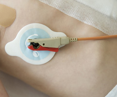
The first thing that came to my mind when I first saw their new icon was electroencephalogram stickers[1], or maybe those stickers that hold on heart monitors in the hospital.
1. see pic on the right here: http://www.epilepsygroup.com/notes6-35-63/new_patient.php
EDIT: I was told by my friend who is a nurse that the more accurate example would be "telemetry leads" - http://www.wireless-technology-advisor.com/images/cardiac-te...
It is fun bashing uber but I am not sure this is quite as bad in all respects as this article makes out. In particular I like the black square icon, it is bold and unique. Their Android and ios icons though are pretty bad. Too bad they couldn't have stayed with the bold black square for those as well with some way to ensure it has good visibility.
Black monolith icon -- I like it.
For someone not part of the design process, the author sure seems to know how everybody on the team has been feeling during the redesign process.
"The Uber brand guidelines were sure to make clear that they doesn't want their logo to be urinated on or to be associated with condoms or sex. Because there was a real danger that might have happened."
I see ads for Uber on Grindr all the time. What's that about not associating the brand with sex?
Do you remember the time that Marissa Mayer said, referring to Adobe Illustrator, "I’m not a pro, but I know enough to be dangerous" and then "helped" designing the new Yahoo logo? by that time, Mayer's (micro)management style had already resulted in the Lead Yahoo Mail Designer quitting the company[1].
This time it seems that, because of Kalanick's micromanagement of the Uber logo design, Uber's Head of Design has left the company[2].
A non-technical co-founder shouldn't write code, right? So I don't understand why a non-designer co-founder should design a logo.
[1] http://www.inc.com/cody-steve/yahoo-logo-redesign-marissa-ma... [2] http://www.fastcodesign.com/3056457/fast-feed/ubers-head-of-...
> It felt wrong for Uber’s global and local brands to revolve around the color preferences of a rich, white guy in California - even if that rich, white guy in California is the CEO.
It worked for Steve Jobs at Apple.
It took me like 30s to figure out the change, and I haven't had any problems with it since.
Not sure this is going to topple the company. I think this is a case of, "I do this for a living so it's super duper important". The branding redesign probably isn't as important as this author claims.
Uber's rebranding is a management classic. It will be studied for decades as an example of what happens when committees create things.
I assumed the backwards 'C' was the incomplete progress bar. First I thought Uber is updating. Then when I realized it is the new icon, I thought it is meant to signify urgency of "your cab arriving."
In no universe did I imagine an atom or a bit there. Why does the bit have a tail that makes an atom a backwards C?
Pixel art on city landscapes would have conveyed their point better, and would have looked better.
Not to detract but it's a somewhat similar issue albeit probably will never elevate to the same level, but LastPass also just went through a logo redesign and it's equally rather puzzling.
The logo went from
http://cdn.makeuseof.com/wp-content/uploads/2012/08/lastpass...
to
https://lh3.googleusercontent.com/VUywxm7hR04d-hXnhenjtLcwHG...
Considering things like that the three dots simply look like any number of other menu icons, especially on android where you can have three of those ellipsis type of icons in one view sometimes; I'm not sure that was all that smart of an idea. In case you didn't notice/realize it like I didn't, that's a cursor at the end of what are supposed to be three hidden characters. It's just an odd choice in my opinion.
The amount of hubris this article describes is staggering.
And I say this as a long-time Uber fan.
I wonder if this destruction of brand equity will mean Uber have to write down the "intangible assets" section of their balance sheet.
Wow, I didn't think the day would come when I felt sorry for designers.
I am confused. How's the app logo nowhere on the homepage? Did they go with UBER, black square, and the weird backward C thing all at the same time? In addition the font for Uber front page does not match the Uber logo once you log it (where the U seems to have a little curve to it). Get it together, people!
The article reads like the author has a personal hatred against Uber, it makes it hard for me to accept his opinions.
Would have been better if he took a more objective look at Uber's redesign instead of taking the time to bash the CEO or the designers.
Seeing the iOS logo always makes me think for a second that the app is being updated.
Is it just me, or does anyone else think those two icons look like toilet seats?
"All in all, it is remarkable that the Uber team produced what they did given the circumstances–truly a testimonial to the patience of Uber's Design Director Shalin Amin and former Head of Design, Andrew Crow, who not so inconspicuously departed the company immediately after the redesign."
Is there a difference between "head of design" and "design director"? They seem to have been at the company at the same time - correct? Just can't understand what the difference between these two positions would be...?
How much a branding has actually impact in a product like this? Uber is pretty much the only option for ridesharing in my country, and I guess in most countries in the world. I guess you can harm the brand a little by doing some redesign or something, but I think in the end it doesn't matter that much. The most important thing is that the product works, for a good enough price. I personally at least don't care a bit what the uber icon on my phone is, and I doubt that majority of consumers do.
The new logo looks like Pacman after assimilation by the Borg.
Maybe that's indicative of the new 'data platform' development team they're actively recruiting for.
Lately I've seen quite a few people reach for their phone, not find the Uber app right away and they just click on that pink mustache instead.
Who gives a damn. At this point Uber could choose a turd as their logo, and they'd still be successful.
Wow talk about a nuclear facepalm. I'd bet Uber doesn't make it through the crash if this is how their thinking process works at the top level.
I used to use Uber quite regularly.
In the past year, I have had several drivers bring up, of their own volition, their dissatisfaction with the fact that tipping Uber drivers is uncommon. It is quite clearly stated in Uber's app and website that there is "no need to tip". I'm not a cheapskate, but I don't carry cash most of the time, and their veiled reminders/requests made me uncomfortable.
It probably sounds strange, but the ridiculous logo change on top of the changing driver culture have made me remove Uber from my transportation-method choices.
Fickle creature I am.
Wait, but finally what does this shape/icon mean?
I remember similar sentiment when AirBnB did their rebrand. An article comparing the rebrands of the two companies would be interesting.
Seems like an example of a CEO with an over abundance of hubris.
Interesting read.
Funnily enough, I used Uber three days ago and didn't notice any chance at all. But after I read the article I checked the Uber logo on my iPhone, and there it was, the new logo staring at me.
Apropos of nothing:
> English is the lingua franca of the world
I love reading, and hearing, these words. Heh.
He seems very bitter about something.
Are we supposed to know who Amin is? The article starts referring to him with no introduction.
What a clickbait title. This is not about meltdown but design.
Pretty ugly and meaningless symbols. A square and a circle with some lines... must be uber! lol
Compare that with Coca-Cola where there is no mistaking it.
This reads like an oddly smug attack on a fairly successful redesign.
"Leading up to the Super Bowl, Uber’s Twitter feed was all puppies."
Does the writer not get that the "Puppy Bowl" was on at the time? Animal Planet's special show is very popular alternative to the "Let's not compete with Super Bowl" lull on TV.
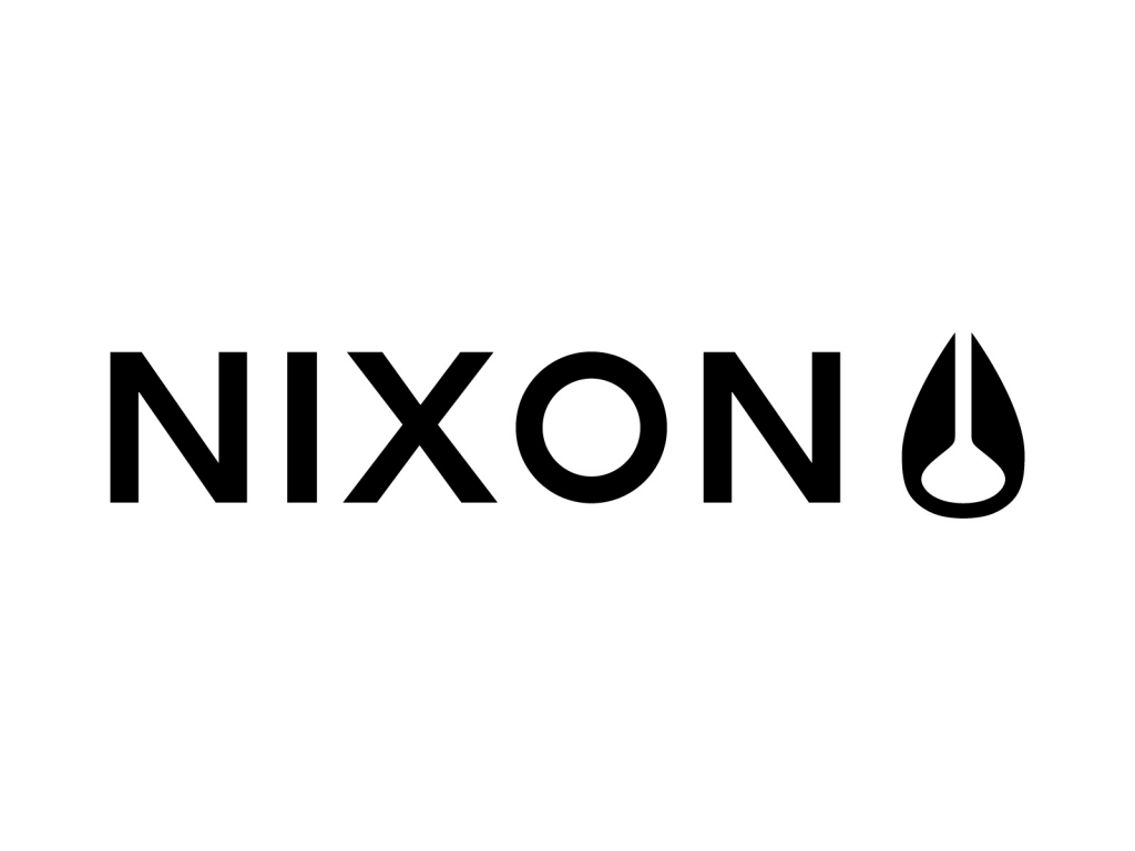
Honestly? This looks like Nixon's logo, just tipped on the side and modified slightly:
I think one of the best points of this piece is referencing the iconic U sticker that nearly all Uber drivers have on their windshield or passenger window. When I've taken an Uber in an unfamiliar city (the bulk of my Uber trips basically) and I'm on a busy street corner, seeing the unmistakeable black-and-white sticker lets me know quickly and simply that I'm hopping into the right car, or where to start walking if it's 100' away.
What will the new Uber car sticker look like from afar? A circuit board? A community college parking lot pass? There's no way it will be as obvious and instantly recognizable as a big U sticker. In fact I can't even imagine Uber drivers will swap their decals out, ever, so it'll create a rift in the overall brand (drivers with U stickers, website/app with the new brand) and increase overall confusion with passengers.