As far as analogies go, I think it's closest to the chromium logo [1], when kinematically interpreted as some sort of extruding shell segments [2], or blades of an aperture (Aperture Science). Overall it's visual language elements are surely intentionally aligned well centered in a space between IE ℮, Chrome and Firefox.
[1] current: https://commons.wikimedia.org/wiki/File:Chromium_11_Logo.svg
[2] old chromium(2009-2011): https://commons.wikimedia.org/wiki/File:Chromium_Logo.svg https://codereview.chromium.org/2806029/patch/1/61
So, like... does EVERYONE think it looks too much like the Firefox logo, or...
I hope they have as much success with this as they've had with VS Code and I'm looking forward to trying their first release of Edge on Linux. It will be great to have the choice of a non-Google, WebKit based browser from a major distributor who has the resources to keep up with and challenge Google on things like Manifest v3.
I find it somewhat ironic that the most used software I'm running on my Linux desktop, VS Code, is a free and open source Microsoft product. It's also the product that really enabled me to make the switch in comfort. Maybe soon though I'll be using Bing more too (among others like DDG) if Google decides to completely remove URLs from search result links.
It reminds me of The Great Wave off Kanagawa.
The further they can move away from the legacy of Internet Explorer, the better.
I can totally see this confusing less technically literate people. I think too many people are trained to just click the blue E.
I think I do like it. I think it fits what Microsoft is trying to do with their design scheme.
It's the "c" of Chredge, isn't it?
Firefox Nightly, I'd say: https://pbs.twimg.com/profile_images/1160831232357351425/dlf...
If you rotate 180 degrees up, it looks like a “G” which I guess is appropriate as it is based on Chrome’s rendering engine.
Looks mostly like the Firefox logo
I don’t hate it, kinda cool actually, but missing something. Perhaps text.
I like it.
I’m not sure I’m a fan. It’s like a profile shot of a laughing bulbous head. It says supermarket brand laundry detergent to me.
Well now if you're colour blind you may not know if you're clicking on Firefox or Edge.
Most comments say it either looks like Firefox’s logo or Chrome’s. I think it’s kinda both.
Good logo but that is not going to have anyone start using edge. They offer nothing new. I think brave is far better and innovative browser if anyone wants to try something different then chrome or FF.
Is there a source that us with ad blockers can see?
It looks very underwhelming and lacks personality.
It screams “impending doom” to me.
I thought they were replacing edge with Blink soon?
Microsoft reveals new browser for Microsoft Edge.
I just see ansolutely no reason why I would use microsoft edge
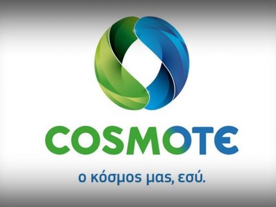
They might be sued: https://www.newmoney.gr/wp-content/uploads/2019/07/cosmote-1...
It's an endless joy for me when Microsoft fails to get traction with their new shiny browser and changes something as a fresh start.
It's a decent browser but never again IE. Keep rebranding the browser downloading tool, Microsoft.
That said, these days I am annoyed by "This browser is not supported, use Chrome" messages. Maybe the the history does not repeat but rhymes after all.
Browsers should be made by non-profits like mozilla, in my opinion.
Firefox Developer Edition logo for comparison:
https://upload.wikimedia.org/wikipedia/commons/thumb/3/30/Fi...