The sound of dial-up explained:
https://oona.windytan.com/posters/dialup-final.png
from https://www.windytan.com/2012/11/the-sound-of-dialup-picture...
The list of linux distributions on Wikipedia: https://upload.wikimedia.org/wikipedia/commons/b/b5/Linux_Di...
I like railroad diagrams for language grammars. So much easier than just looking at production rules.
https://en.wikipedia.org/wiki/Syntax_diagram
They're used at https://json.org/, for example.
Not sure if it fits in scope, but I find this classic to be an ingenious intro to where to start from in terms of visualisation: https://bost.ocks.org/mike/algorithms/
I often cite this diagram: https://upload.wikimedia.org/wikipedia/commons/3/37/Netfilte... as my favorite picture. It shows the logical flow of packets through Linux. I'm pretty sure my career would be on a very different trajectory had I not discovered an earlier version of it back in ~2006.
Not as academic as some of the other replies, and certainly not all of them are CS-related, but Bartosz Ciechanowski's interactive web illustrations are fantastic examples of modern visuals.
Things like:
GPS: https://ciechanow.ski/gps/
Alpha Compositing: https://ciechanow.ski/alpha-compositing/
Floating Point numbers: https://ciechanow.ski/exposing-floating-point/
There are some great visualizations by 3b1b: https://www.3blue1brown.com/
Recently he had done a video about convolution. And his videos about neural networks are pretty good. He has recommendation video for other good channels too.
Great blog on Myers diff series: https://blog.jcoglan.com/2017/02/12/the-myers-diff-algorithm...
Not technical illustrations but, some funny jokes in unix haters handbook is pretty funny. https://web.mit.edu/~simsong/www/ugh.pdf
There is also unix magic poster: https://archive.org/details/unix-magic-poster-gary-overcare-...
My favorite artistic illustration is probably Jorge Stolfi's drawing inspired by the self-adjusting splay tree data structure of Sleator and Tarjan: https://www.link.cs.cmu.edu/splay/tree5.jpg
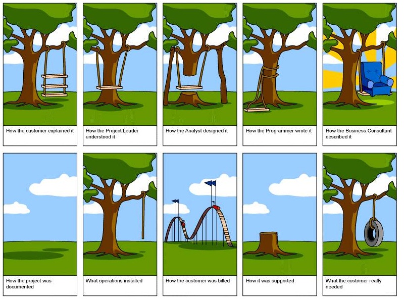
I don't remember the original source of this image but it's a comical take on the SDLC, showing how different roles / teams understand what the customer wanted versus needed when building a tree swing:
https://paleofuture.com/blog/2009/3/23/computer-criminals-of...
"The 1981 book School, Work and Play (World of Tomorrow) features this beautiful two-page spread. Apparently, thanks to computers, there's no crime in the future outside of the computerized variety. The "computer criminal" pictured really doesn't appear to be running very fast. Maybe they're playing a game of freeze-tag. Or maybe that policeman's gun has special settings the author didn't tell us about. I like to believe the former, but that's just me."
Unix Magic is pretty good.
Not strictly computer science, but I love this animation of a Fourier Series and I show it every time I have to explain it to somone
https://en.wikipedia.org/wiki/Fourier_series#/media/File:Fou...
The classic sorting algo videos with sound come to mind first: https://www.youtube.com/watch?v=kPRA0W1kECg . Mergesort is my favorite video.
The main resource on learning Erlang, https://learnyousomeerlang.com, has a lot of funny ones, some of which are useful.
May I add one that I made?
Illustration of QuickSort and MergeSort as two sides of the same coin: http://lkozma.net/images/sort/duality.pdf
I find this somehow both obvious and counter-intuitive, and usually the two algorithms are not presented in this way, as duals of each other.
I wrote up this view in more detail, but the figure above should be self-explanatory: http://lkozma.net/blog/a-dual-view-of-sorting-algorithms/
Various things explained without words in the same style as IKEA mounting instructions. Here is public key cryptography: https://idea-instructions.com/public-key/ and quicksort (KVICK SÖRT) https://idea-instructions.com/quick-sort/
In Networking, two illustrations of congestion control are just fantastic IMO.
First one is [1], by Chiu and Jain (page 7, figure 5), showing that Additive Increase / Multiplicative decrease is the only simple policy that converges among 2 senders (with rates x and y) to a rate that is fair (along the y=x diagonal) and efficient (along the x+y=Bandwidth). This is the basis of the algorithm that made TCP (and the Internet as we know it today) possible.
The other one is this diagram from BBR [2] (from the paper in [3]), that shows how BBR sets the window ("amount in flight") to the bandwidth-delay product (BDP) of the bottleneck link (the "volume" of the pipe in a water analogy). The cool thing is that you can only measure the delay of the link if you window is <= the BDP, and you can only measure the bandwidth if your window is >= the BDP, so the algorithm has to hover around this point to make sure it can determine both.
[1] Chiu and Jain, Analysis of the Increase and Decrease Algorithms for Congestion Avoidance in Computer Networks, 1989, https://www.cse.wustl.edu/~jain/papers/ftp/cong_av.pdf
[2] https://dl.acm.org/cms/attachment/9cf72499-b32d-4426-914b-cd...
[3] BBR: Congestion-Based Congestion Control https://queue.acm.org/detail.cfm?id=3022184
For network communication (and other stuff), I like sequence diagrams:
https://en.wikipedia.org/wiki/Sequence_diagram
There's a standardized UML version of this, but I think it's easier to read when the arrows are sloped a little, like in this random example: https://www.graffletopia.com/stencils/1560
The relations between Hilbert Curves[1], Gray Code, De Bruijn sequences[2]...
https://en.wikipedia.org/wiki/Hilbert_curve https://en.wikipedia.org/wiki/De_Bruijn_sequence
I want to make use of it in ClickHouse, but we did not (yet), see https://github.com/ClickHouse/ClickHouse/issues/41195
Differentiation of an algebraic data type, resulting in its zipper: https://upload.wikimedia.org/wikipedia/commons/c/c7/Labyrint...
Explanation: https://en.m.wikibooks.org/wiki/Haskell/Zippers (cites: http://strictlypositive.org/diff.pdf)
Centralized, Decentralized and Distributed Networking https://www.rand.org/content/rand/pubs/research_memoranda/RM...
Drawing of self adjusting trees by Jorge Stolfi.
My favorite is more a small presentation than an image: Admiral Grace Hoper Explains a Nanosecond. https://www.youtube.com/watch?v=9eyFDBPk4Yw
For me it changed my mind on wasting time on less efficient algorithms.
"What The Hell Have You Built" a classic from the NoSQL / Big Data / Distributed Systems heyday of the early 2010's
I really like the diagrams from Refactoring.Guru. They provide clear representation of what the design patterns are solving, along with real world analogies.
Example with factories: https://refactoring.guru/design-patterns/factory-method
I can't really come up with any good illustrations for something complex off the top of my head, so I'll go for a really simple one. In fact, that's part of its beauty.
When I had to deal with the signals from a rotary encoder the first time (being a programmer with two left hands and zero hardware affinity), I had a look at a couple of C libraries but didn't have the patience to slog through their implementations in order to understand what signals they were decoding.
...until I saw this: https://github.com/PaulStoffregen/Encoder/blob/master/Encode...
I'm not sure if it was this exact library, but that's the comment I saw. Nice and obvious, in contrast to all the obscure attempts to convey what was happening all the other libs made through prose comments.
The "cascading failure" GIF[1] from Wikipedia's entry of the same name[2].
(I'd love to see similar style animations of various crypto algorithms like MD5, AES, etc if anyone has the cycles.)
[1] https://upload.wikimedia.org/wikipedia/commons/b/bd/Networkf...
Diagrams that show LDA, STA, cycles, etc. Like this one -> https://iitestudent.blogspot.com/2011/06/timing-diagram-for-...
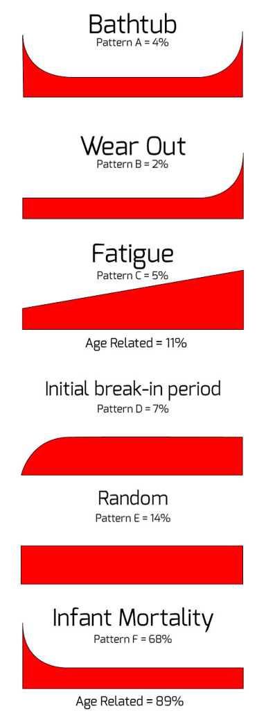
Variations on mean time between failure curves: https://hpreliability.com/wp-content/uploads/2015/09/Failure...
Comparing solutions based on the perceived reliability curves of their lifecycles is useful.
Not from the CS world, but I've always enjoyed the Smith Chart. It's a tool to figure out impedance (eg resistance but a complex number) matching on a boundary to reduce reflected power.
This gif explaining aliasing completely intuitively, without any words or symbols: https://commons.wikimedia.org/wiki/File:Nyquist_Shannon_theo...
No CS but Mathematics. A series of videos/animations by Welch Labs;
Imaginary Numbers are Real - https://www.youtube.com/playlist?list=PLiaHhY2iBX9g6KIvZ_703...
The above presentation in pdf: https://www.welchlabs.com/resources
This is the first teaching video/animation which wowed me (i prefer hard copy books).
These animations by Mike Bostock are great:
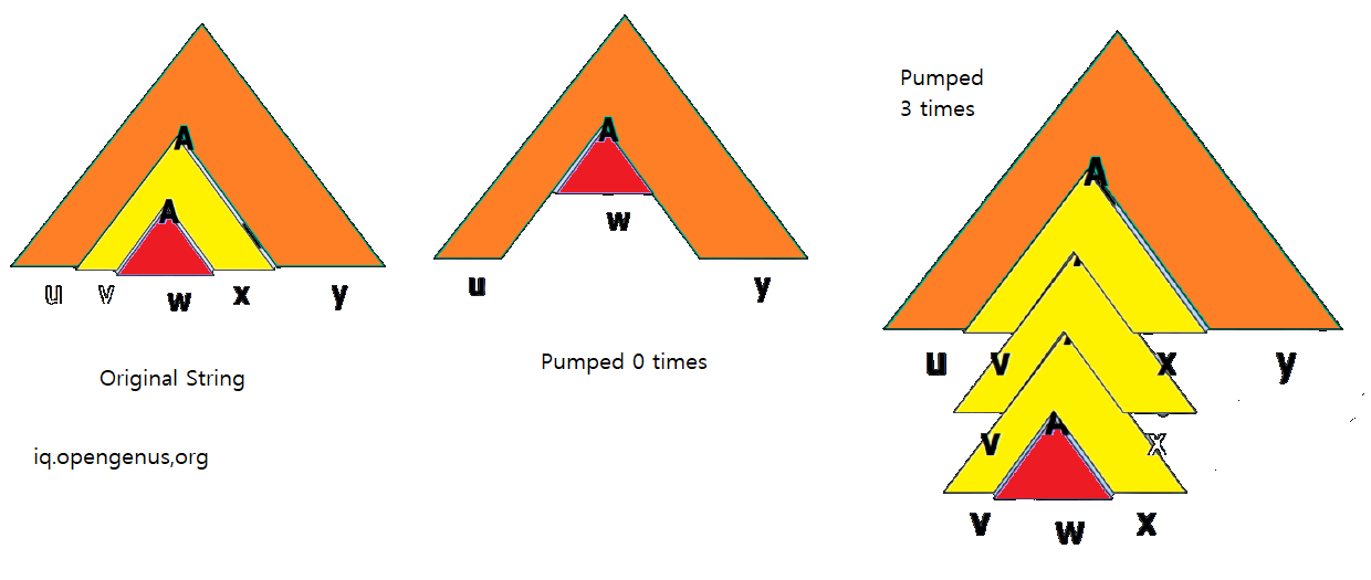
The pumping lemma [0] nested triangles is one of my favorites: https://iq.opengenus.org/content/images/2021/09/pumping-lemm...
[0] https://en.wikipedia.org/wiki/Pumping_lemma_for_context-free...
I absolutely adore this Dilbert comic, not really strictly Computer Science nor illustrating a concept, but I think it is pretty funny. https://dilbert.com/strip/1995-06-24
http://www.r2d3.us/visual-intro-to-machine-learning-part-1/
This one will stay with me for life i think
Though perhaps more of a visualization than an illustration
Anything from Setosa [0] is really good. It contains interactive, animated illustrations of several Machine Learning ideas.
I _loved_ reading papers from Distill Pub [1] as they contained interactive diagrams.
My most favorite one so far is the thread on Differentiable Self-organizing Systems [2]. I liked the lizard example very much as it is interactive, and lizards grow lost organs back. I think this is funny.
[0]: https://setosa.io
[1]: https://distill.pub
Bret Victor's animated explanation of Abstraction: http://worrydream.com/LadderOfAbstraction/
His approach to visualization is I think by far one of the best things on the internet. His rework of a classic paper on small world networks is fantastic as well: http://worrydream.com/ScientificCommunicationAsSequentialArt...
Shameless plug: I drew 36 illustrations of various data structures from simple ones like stack and binary trees to advanced ones like skip list and Merkle tree, and sell them as collectible card decks [0].
Use code HAPPY23 to save 15%.
[0] https://cs.cards
I've been enjoying the illustrations at architecturenotes.co especially the posts about redis [1] and things you should know about databases [2]
[1] https://architecturenotes.co/redis/ [2] https://architecturenotes.co/things-you-should-know-about-da...
The two plots that explain Kernighan's lever: https://www.linusakesson.net/programming/kernighans-lever/
My favorite illustration is from Thinking Forth by Leo Brodie.
Here is a link to an article with my favorite picture from the book as its main image:
https://hackerboss.com/thinking-forth-the-unsung-classic/
It shows the "Universal Processor" which looks like a cross between a computer and a liquidizer and has a big knob on the front with "Data", "Word", "Food" on it! It is a humorous illustration of "An overgeneralized solution".
In fact Thinking Forth has lots of great humorous cartoons and super insights into making real software that it is still a good read today. You'll learn a bit of Forth too!
I read this book at a formative age, and despite not writing a great deal of Forth code, the philosophy of this book has stuck with me.
Here is a link where you can get an electronic copy as it is out of print now and Leo Brodie has graciously allowed it to be distributed under the Creative Commons license.
Sort animations.
https://www.hackerearth.com/practice/algorithms/sorting/quic...
Not only related to CS, but to most management areas and life as a whole. Going from state(A) to state(B) should never be that complicated, right? Oversimplification at its prime.
https://www.thelogocreative.co.uk/wp-content/uploads/How-to-...
The old Usborne books as a kid
https://www.fastcompany.com/3056519/design-lessons-from-the-...
They released them as free pdfs a while back, but I can't find it now. Looks like they stopped that.
I don't know how useful it is, but this depiction of a lexical scanner in Bob Nystrom's Crafting Interpreters always stuck with me.
https://craftinginterpreters.com/image/scanning/lexigator.pn...
Anything by Maggie Appleton.
For example: https://maggieappleton.com/databases
Does Hungarian dancers implementing sorting algorithms count as an illustration?
https://www.youtube.com/watch?v=EdIKIf9mHk0&list=PLOmdoKois7...
The Elliptic Curve explainer GIF in this blog post:
https://blog.cloudflare.com/a-relatively-easy-to-understand-...
Maybe this image if the URL doesn’t get munged:
https://blog.cloudflare.com/cdn-cgi/mirage/551bd7d005a1232db...
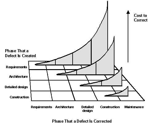
My fave is the “aging” diagram[0], for software bugs, from Steve McConnell’s famous Software Quality at Top Speed essay[1].
[0] https://stevemcconnell.com/wp-content/uploads/2017/08/art04-...
[1] https://stevemcconnell.com/articles/software-quality-at-top-... (The illustrations are slightly broken. You need to tap|click on the placeholder, to display the image).
"A Self-Adjusting Search Tree" https://www.link.cs.cmu.edu/splay/#:~:text=A%20Self%2DAdjust...
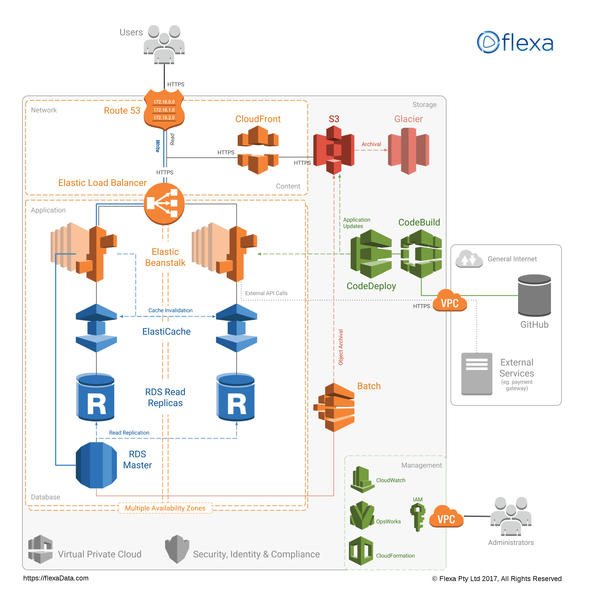
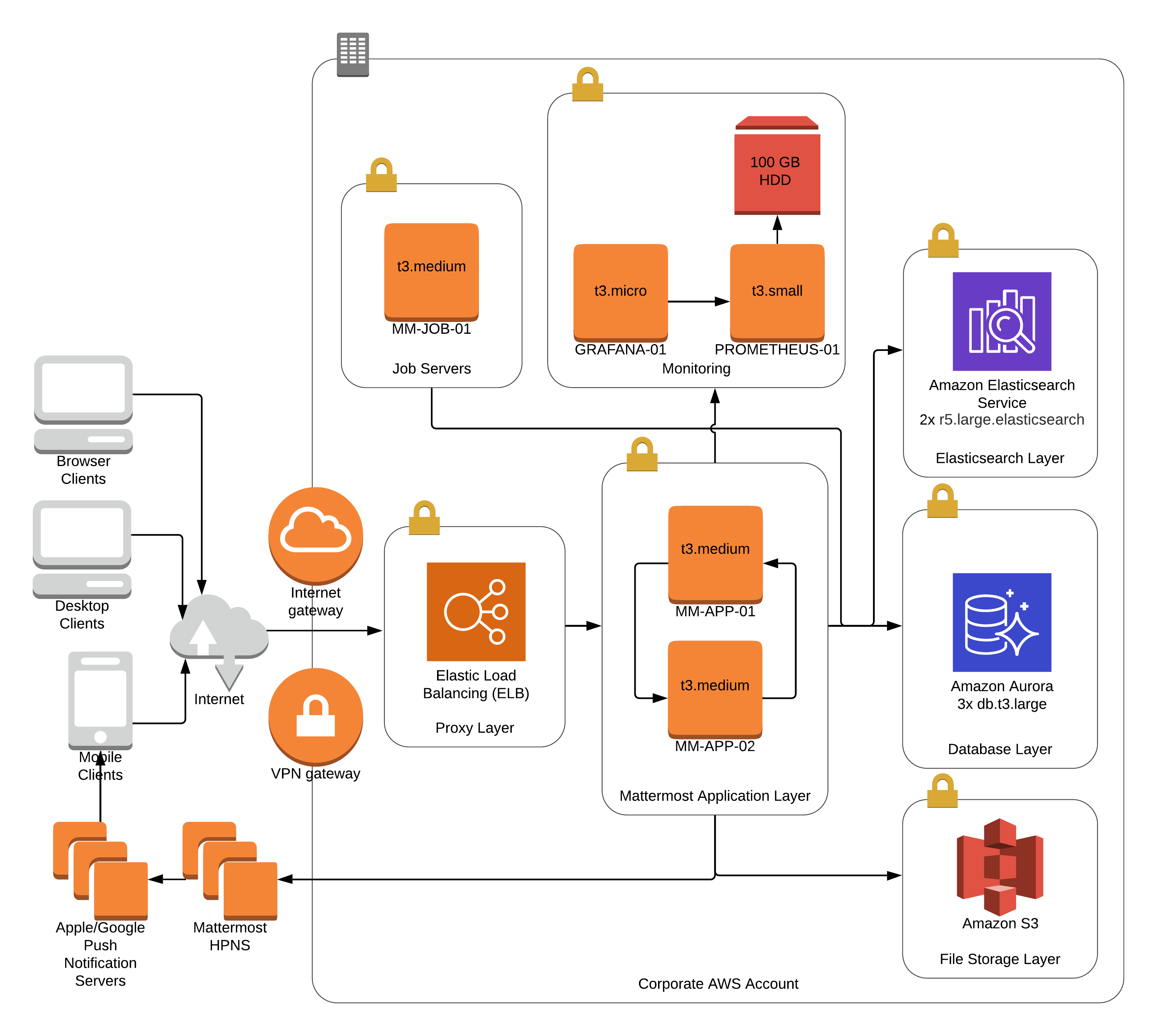
Don't know if it is the favorite of mine but AWS Architecture Diagrams.
For example:
https://i.pinimg.com/originals/a7/bc/49/a7bc49be1828ca9a51e4...
https://flexadata.com/images/architecture/ntier-application-...
https://docs.mattermost.com/_images/MattermostDeployment5kaw...
The Tanenbaum books on operating systems [1] and networks [2]. Here are just two samples, the various editions each have their slightly different illustrations.
I've always found it really awesome how the cover of a book can clarify concepts in such a funny and concise way :)
[1] https://www.amazon.com/Modern-Operating-Systems-Andrew-Tanen...
[2] https://www.amazon.com/Computer-Networks-2-downloads-Andrew-...
From Feynman Lectures on Computation:
Figure 7.64 "Circuit diagram for a PLA", which demonstrates how the logical duality between AND and OR is reflected, at the physical gate level, by a π/4 rotation between encode and decode planes.
The list monster from _Learn you a Haskell_:
If you include deep learning in CS then https://distill.pub/ has a lot to offer in this category.
My favorite is the JSON syntax diagram https://www.json.org/json-en.html
Anything from Red Blob Games: https://www.redblobgames.com/
I worked at several companies that had this poster hanging on the wall back in the day and spent a lot of time staring at it while on the phone. It comes immediately to mind.
The cipher mode of operations on wikipedia. I bet you anyone that does even a little amount of cryptography will bring up the CBC one from https://en.wikipedia.org/wiki/Block_cipher_mode_of_operation...
The cover of the 1st edition of the "dragon book" -- Compilers: Principles, Techniques, and Tools, by Aho, Sethi and Ullman
https://www.amazon.com/Compilers-Principles-Techniques-Alfre...
Log-structured merge trees have some good diagrams.
If you know a little bit about the problem space, the 3 main diagrams (2.1, 2.2, 3.1) in the whitepaper basically tell you how to implement it.
Not as exciting as many others, but I always have a soft spot for the old centralised/decentralised/distributed systems diagram: https://www.researchgate.net/profile/Christopher-Ehmke-2/pub...
It was my first introduction into actually thinking about and working with distributed systems at University, a field I've been in love with since, so it seems quite formative. Plus I always thought aesthetically it looks lovely, like it'd make a good tattoo.
Absolutely loved the illustrations from https://pikuma.com/blog/isometric-projection-in-games about isometric projections in games. A work of art, and engineering.
Weird that no one seems to have mentioned the Unix Wizard poster: https://jpmens.net/2021/04/09/the-unix-magic-poster/
Oh man a friend of mine used to have a shirt with a delightful illustration of the madness that is ATM, or maybe it was just illustrating IP-over-ATM. It had packets being like thrown into woodchippers and reassembled if I’m remembering right. Wish I could find it again.
Martin Fowlers diagram on the cost of presumptive features / YAGNI. It nicely breaks down the costs, whether it’s the right feature or not!
https://martinfowler.com/bliki/Yagni.html (Scroll a bit).
Diffie-Hellman key exchange pictures that use mixing colours to illustrate the concept.
I really like this comic. Mainly the "Testing in production" near the bottom right.
It mocks agile in it's different forms.
I have the opposite: my most hated illustration.
It's the standard diagram of how Transformer language model works (https://www.researchgate.net/figure/Transformer-Language-Mod...). When I tried to figure out transformers, I saw it in every single paper, and it didn't help almost at all. I think I finally got a good understanding only when I looked at a few implementations.
Wikipedia's animated illustrations of sorting algorithms are awesome:
From Transaction Processing: Concepts and Techniques:
Figure 2.3 (also inside the front hardcover) "The Price/Performance Tradeoff"
A diptych of size vs. cost, and latency vs. cost, for various storage technologies (in 1990. that said, the shape of the curves has not changed much in 3 decades; only the absolute numbers are out of date)
(FWIW, the "tape robot" streamed architecture they predicted has indeed come to pass; it's just that we use network flows instead of tape robots as our stream endpoints)
Not useful, nor aesthetic perhaps.
I think the field of automata has some lovely diagrams.
https://en.m.wikipedia.org/wiki/Automata_theory
I'm sure many are familiar with state diagrams, directed graphs that can be used to explain regular expressions or any other FSM
Turing machines also can be represented with a diagram featuring a "tape" - so elegant
Professor Rick Thomas made a great impression on me whilst lecturing on the subject of Automata
A visualization of the basis functions for the discrete cosine transform by Brian Hayes in his American Scientist post a long time ago [0].
For some reason, Fourier transforms just didn't click until I saw that picture.
[0] http://bit-player.org/wp-content/extras/bph-publications/AmS...
And also every article in this website:
From Gödel Escher Bach:
Figure 40. (a collage of scripts, demonstrating how meaning can be carried in strings of [many different choices of sets of] symbols: compare Turing or Shannon)
Figures 135 & 136. (Escher's Drawing Hands, followed by a structural sketch showing how the paradox of mutual recursion can be solved by something implicit and prior to both: compare McCarthy or Curry's Y combinator)
Learn You A Haskell is full of useful illustrations.
Funny one. . . http://gunshowcomic.com/648
arbital's article on Bayes Theorem contains a waterfall diagram that just perfectly encapsulates the idea, at least to me.
Linking the whole article but if you scroll it's the 5th image. https://arbital.com/p/bayes_rule/?l=693
I'd really like to see more eye pleasing version of this, but those symmetries are wild - Quasi-periodicity 17 fold symmetry - https://www.goldennumber.net/quasi-crystals/#jp-carousel-988...
I really like this ELF format diagram (https://en.wikipedia.org/wiki/Executable_and_Linkable_Format...)
tcp/ip state transition diagram (over here: https://users.cs.northwestern.edu/~agupta/cs340/project2/TCP... )
however it takes a while to get all the details...
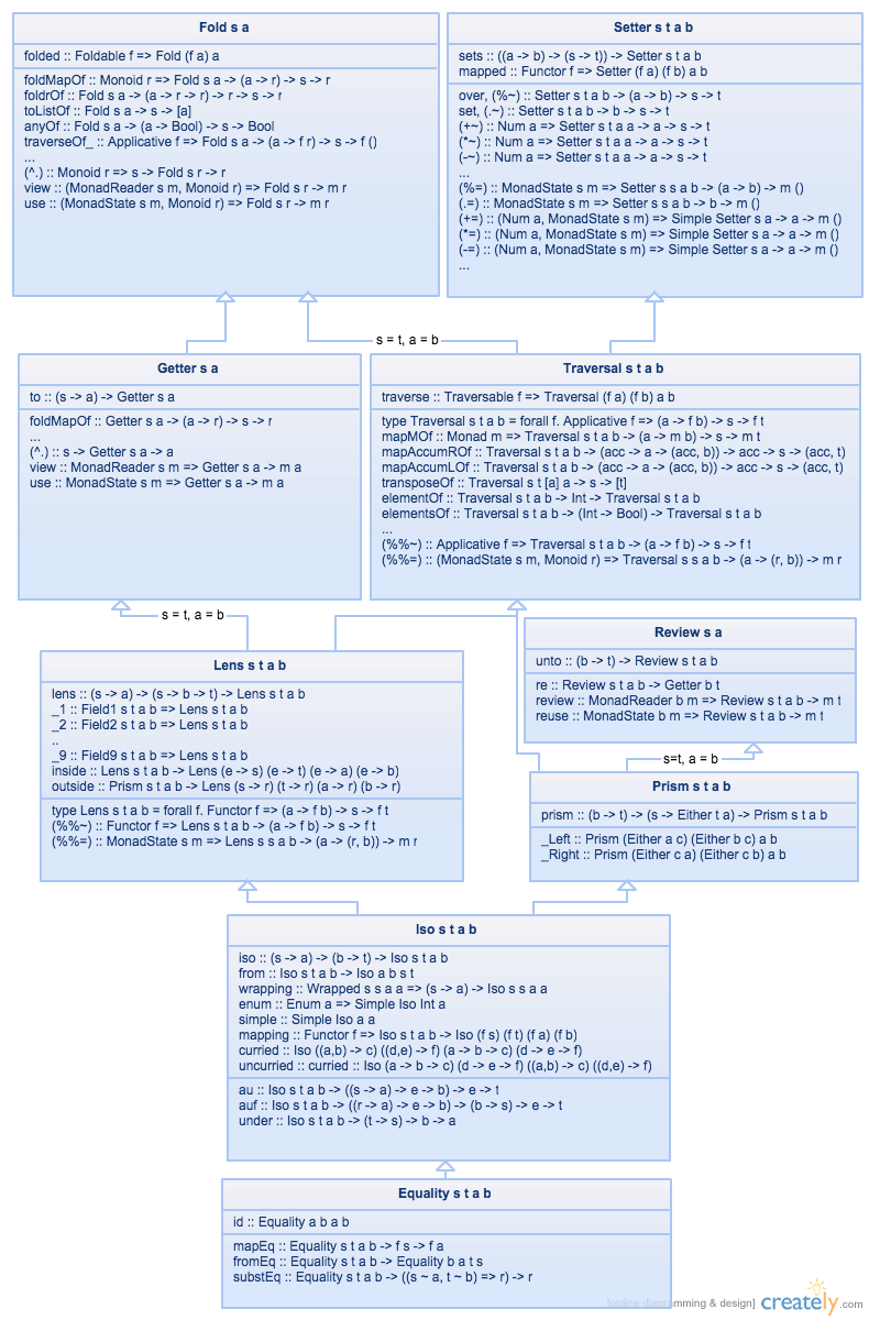
Definitely not my favorite, but useful enough. A cheatsheet for `lens` haskell library:
https://raw.githubusercontent.com/wiki/ekmett/lens/images/Hi...
Everything from Land of Lisp!
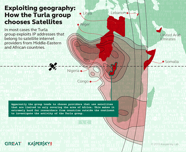
Does this count?
https://www.kaspersky.com/content/en-global/images/repositor...
I don't think it needs explanation. Pretty wild.
I drew a 9 page DTM that implemented binary multiplication for an assignment in a CS class at USC (southern cal) in the mid-90's. It is my favorite CS illustration. However, I am certain that no one else would be interested in it, as it is very specific, archaic, and personal.
What came to my mind is "An Introduction to Microcomputers" by Adam Osborne. I don't think I can find my copy anymore. If I remember correctly, there were block diagrams showing the main functional components of a microcomputer, E.G. the ALU, Arithmetic Logic Unit.
I like the one from my book the best: https://www.fullstackoptimization.com/wp-content/uploads/sys...
Likely the diagram of the multiphase multi-tape sort diagram that was a foldout in the first edition of TAoCP. As tape fades from memory and usage, the diagram has been removed. It is a sentimental favorite of mine as tape was important in the early part of my career.
For me, Penrose Tiling (https://en.wikipedia.org/wiki/Penrose_tiling) is an intersection of math, computation, architecture and design.
A while back I made a small NFT collection with my favorite CS illustrations:
https://instagram.com/citationsnft
It was an experiment that didn’t do much commercially, but we learned a lot from it.
The progress graphic in the Disk Defragmenter tool shipped with Windows 95 and Windows 98.
The “I wan to run an agile project” animation https://youtu.be/4u5N00ApR_k Nothing comes close to this, sums up the whole idea from bottom to the top perfectly
I guess someone has to mention the Periodic Table of Perl-6 operators: https://www.ozonehouse.com/mark/periodic/
SSH tunnels: https://unix.stackexchange.com/a/115906
Ever wanted to look inside of a CPU executing code? http://visual6502.org/JSSim/index.html
https://github.com/girliemac/a-picture-is-worth-a-1000-words
Specially the git-purr one that explains git.
I think of this one:
https://archive.org/details/unix-magic-poster-gary-overcare-...
Code Cartoons by Lin Clark.
All the basics of computer science and algos explained brilliantly https://medium.com/basecs
A couple of my favorites, including “A good architect leaves a footprint”
Sorting out sorting is a classic! https://www.youtube.com/watch?v=HnQMDkUFzh4
I love these mechanical mechanisms animations: https://mechamechanisms.com/
This comic by Rory Blyth is my personal favorite:
Watching sorting algorithms _play_ out. For example:
I’ve always found https://rxmarbles.com, illustrating rx functionality pretty neat
Bitcoin Hashmap https://nakamoto.observer/hashmap
Time space diagrams in distributed systems. Very obvious once you see but never before saw some critical problems in distributed systems like fifo ordering, causal ordering and other things explained with such diagrams.
did not have formal education on distributed systems in my country but learned many things in this topic on job.
So then me took course by lindsey kuper on youtube. it is amazing course, super clear instructor even for me with not good english.
i think professor in this class say these diagrams came from leslie lamport who did lot essential thinking in distributed system space
maybe not CS concepts, but wanted to re-share Perpendicular disc storage from Hitachi. https://www.youtube.com/watch?v=xb_PyKuI7II It's a simple concept to explain, but animation sure makes it fun and lasting.
Not an illustration, but I really like the Hungarian Algorythmics videos
Grokking Algorithms is a funny and enjoyable read
TCP Windowing
The glider
(Tech Support Cheat Sheet)
Xkcd, this one https://xkcd.com/303/
I am a little bit surprised that there isn’t more references to cartoons, especially xkcd
breads
I, unfortunately, cannot find an online copy currently.
Knuth's TAOCP's latest published part, Volume 4 Fascicle 6, on Satisfiability contains a number of visualizations that really are amazing and worth just buying a copy of the book for, just to ponder over these images.
The satisfiability problem of whether there exists an assignment of boolean values that makes a given boolean formula evaluate to TRUE is, IMO, truly a fundamental problem in computer science.
Any piece of code with some inputs and outputs can be transformed into a boolean formula (albeit a huge one). This process feels akin to expressing molecules, from simple ones like H2O, to the highly complex proteins that make up much of our Cells, in their constituent atoms and more importantly the atom interactions.
Knuth (EDIT: Actually, Carsten Sinz) takes this concept one step further and produces visualizations of non-trivial boolean formulas that clearly show the regular, both symmetrical and asymmetrical, sometimes fractal-like nature of these formulas.
In my mind, these visualizations are quite powerful and strikingly show the fundamental building blocks of (digital) computation.