Without reading everything there is on the subject, I'd guess it's tilted for the same reason it's tilted to the left.
Humans are tool makers and tool users. After enough time the tool becomes an extension of the body, even if the tip of the tool is mechanically or virtually detached from the hand that is controlling it. The tool maker designed this as a right-handed tool, coming into the frame in the right hand.
If the reason for the tilt direction was not this, then there would be no reason why it shouldn't tilt the other way. If you're right handed, try a right-leading cursor . It doesn't just look wrong, it feels wrong because it looks like a tool held in the left hand.
Does this have an effect on left-handed people? Perhaps. I'm left handed and it always felt wrong to use the mouse in my left hand. Is it because of the direction of the tilt? Who knows!
None of the Stack Overflow answers mention Alan Kay, who created the angled mouse cursor at PARC. When asked about this¹, he responded:
"The Parc mouse cursor appearance was done (actually by me) because in a 16x16 grid of one-bit pixels (what the Alto at Parc used for a cursor) this gives you a nice arrowhead if you have one side of the arrow vertical and the other angled (along with other things there, I designed and made many of the initial bitmap fonts). Then it stuck, as so many things in computing do."
Time for one of my favourite Youtube videos, by Posy (Michiel de Boer.) 'Mouse cursor history (and why I made my own).'
https://www.youtube.com/watch?v=YThelfB2fvg
It runs through the history of mouse cursors, as well as problems with some of the standard ones, and shows, among other things, historical cursors which were straight and not tilted.
It is one of those amazing videos that make the internet worthwhile, is short, and is by the author of Posy's Cursor Pack, http://www.michieldb.nl/other/cursors/
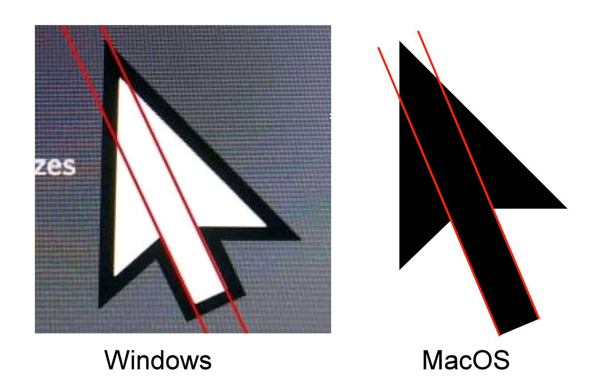
The real question is: Why does Windows cursor look "imperfect"?
https://mspoweruser.com/wp-content/uploads/2020/04/windows-c...
I'd like to add to all of the reasons I find valid (not obscuring what one is pointing at, mimicking pointing with a finger) that everything displayed on the screen is pretty much perpendicular to the x or y axis. The tilted cursor thus sticks out among the rest of the content.
As an aside, as a typical Amiga quirk, the early Amiga mouse cursor was tilted in a 45° angle to the x axis, contrary to all the other popular GUIs with more acute angles for the cursor. And there was a built-in tool for creating custom mouse cursors, which I personally loved. See for example http://toastytech.com/guis/amiga12.html
One compelling reason is so that when pointing at something with the cursor, it doesn't block the thing you're pointing at. If the cursor was mirrored or even centered, hovering over a button would obscure some of the button. This assumes you approach from the bottom right though, which may be in turn because of the cursor's shape-- but I think reading direction is a stronger theory for why you'd want to approach from the bottom right.
Because it mimics the fountain pen? That’s how you hold it when you write with one (the cursor being the virtual tip)
Xerox parc again. I have the feeling everything we have today was invented in this place. How was it possible that it was so successful and influencial?
The point of a pointer is that it should stand off against the things it points at.
A usual GUI for the most part has straight edges and certain symmetries. A cursor that is similarly symmetric will blend in more easily, and get visually lost.
Which way it tilts is secondary, the irregularity of the tilt itself against the rest of the interface is key.
Xerox Park and display reasons aside, I think that the 2nd answer, with the picture of the hand is the best answer apart from historical and technical reasons.
My understanding is that before mouse pointer there was a light pen aka light gun pointer. It was used perpendicularly to the screen, literally pointing at the desired location.
Then, when implementing a more 'remote' on-screen pointer, the notion of pointing perpendicularly at the site was best projected by a tilted 2D marker.
Think of the mouse pointer kinda sticking out of the screen as a dart.
I can't imagine the arm strain the users of the light pen had to endure back in time ... Though the workflow was probably still more keyboard-bound.
Anyone struggling with the answer didn't grow up on 640x480 resolution.
When you have so few pixels, you really want to be able to use the exact pixel you intend.
I have no idea, but a wild guess is that with old hardware the "hot" pixel that could trigger the collision interrupt was fixed to the upper left corner of the hardware sprite.
EDIT: Another thought that crossed my mind is that with very lo-res screens a corner is the only way to get a well defined and sharp (yet fairly wide) arrowhead. The trade-off would be the shaft being pixelated, but the tip is more important.
I agree with all the reasons mentioned ranging from calculating the vertex position - sharp tip of the arrow (x, y) to the pixel issue (low resolution on older machines) to the right-hand pointing direction.
For all practical purposes, I observed 2 other things.
The first is that English is written left to write. If you ever had the experience of using a different language that starts from right to left, this same arrow feels weird.
And the second is a little activity experience.
1. Arrange the 4 files in a square box, 2 up 2 down
2. Notice that as soon as the sharp point of the arrow touches any file boundary, the arrow can select the file by a pixel difference that you can't with a straight arrow (ease of use)
3. It also takes a constant number of operations (best case scenario) compared to the straight arrow where the algorithm has to decide based on the percentage of how much of the straight arrow shape hovers over another file to select
What an incredible historical resource that website is. Just look at the original Ethernet spec here: http://bitsavers.trailing-edge.com/pdf/xerox/ethernet/
> It was found that, given the low resolution of the screens in those days, drawing a straight line (left edge of arrow) and a line at a 45 degree angle (right edge of arrow) was easier to do and more recognizable than the straight cursor.
Ockham's Razor. It really is that simple. Having had to do a lot of "dot art," in The Days of Yore, I understand perfectly, why this choice was made. Some systems did an "unfilled" arrow, with just the outer barbs. Same angle of the shaft, but the barbs were at 90 degrees. Leaning left was chosen, because of the prevalence of righties. The "unfilled" arrow was easier to confuse with the background.
I suspect that many of today's programmers would be absolutely aghast, at the resolution of our screens, back then.
ResEdit FTW!
Although the linked page was highly entertaining, I suspect (and this is pure speculation) that the real answer is that, to the people who had to make the original decisions back in the 70s and early 80s, the current design “looked better”.
For subsequent implementations it is likely mostly inertia.
Again this is all speculation but it doesn’t really have to be any more complex than that.
As a side note in the early 80s as a teenager I wanted to write a space game on my Apple //e computer that had a wedge shaped spacecraft like a star destroyer or the spacecraft from Asteroids. I spent many many hours hand drawing the bitmaps for each size and rotation. The shapes always looked a little jagged, except in the +/- 45 degree orientations.
Top answer [1] (when I'm looking, others seems to refer to other top answers) says that the original cursor _was_ straight, and links to an image, which 404's [2].
Anyone have a working link?
For a better deep dive into mouse cursors with more information, there's Posy's "Mouse Cursor History (and why I made my own)":
https://www.youtube.com/watch?v=YThelfB2fvg
It also shows how absolutely horrid Windows' cursor designs are. They always were. I still remember making my own sets back in the early 2000s when DeviantArt was the home of desktop customization.
I'm surprised nobody has posited an "obscurity" rationale.
When the majority of your information is vertical/horizontal (such as text, window elements, etc), an angled cursor makes it easier to interpolate what's underneath. And the arrow shape keeps the bulk of the icon out of the way of your point of interest (compared to, for example, a reticle - although I expect we'd adapt just fine).
Most SO answers were non-answers or word salads. Thankfully one of you added an answer explaining that the cursor is already straight given that it must be visible from the graphics coordinate origin (upper left) and is 45 degrees wide.
It's funny how much of this stuff comes down to just "because that's how someone did it first". I see this mirrored in my own work, where so many arbitrary decisions are maintained for no reason other than that they were chosen at the outset. Nice to see that applies to basically everything.
Another reason is likely clipping. When drawing the cursor you have to prevent pixels from being drawn off screen to the right or bottom of the screen. If the cursor were symmetric, you would have to watch out for the left edge of the screen as well.
I'm amazed none of the answers are pointing out that a straight cursor is completely non-naturalistic. A cursor tilted to the left resembles an arrow being held in the right hand and being used to point at something.
As someone who played with the DOS text mode fonts a little, I never bothered with that question, assuming left tilt of the arrow was a way to make it visually bigger / more visible
Were the first mouse pointers graphical?
I remember using a black rectangle as a mouse pointer in console based applications - it was literally one character of the console with inverted colors.
look at your right hand right now. how is the mouse oriented? I would be $1000 it's a little to the left, just like your cursor!
My theory. When hovering or clicking on an icon more of the icon is visible with a tilted arrow.
I feel the need to immediately change to an upward pointing cursor to honour Douglas Engelbart.
"When the XEROX PARC machine was built, the cursor changed into a tilted arrow. It was found that, given the low resolution of the screens in those days, drawing a straight line (left edge of arrow) and a line at a 45 degree angle (right edge of arrow) was easier to do and more recognizable than the straight cursor."
Well there ya go right there. The left side of the arrowhead is a nice clean straight line, and the right side of the arrowhead is as close as possible to 45 degrees, cutting down its "jaggedness".
There's ... a lot of dubious and unsourced or poorly sourced answers there.
(2014)
I suppose it makes more sense for left to right text interfaces?
I love Izhaki's visual explanation.
The "saves a calculation" answer sounds like complete horseshit. Any machine fast enough to update a mouse cursor every time the mouse moves could have afforded two additional subtractions on a click event.
I was just going through my regular Sunday morning routine when I opened hn and realized I'm the second most upvoted answer to this question.
That was 10 years ago.
Is it right? Probably not.
Did I answer instinctively? Yes.
Is it a problem to keep it there? I don't think so, there are plenty of other explanations in the same page.
Am I providing further evidence? No.
Please refer to https://xkcd.com/386/
[flagged]
It's a bit scary to see that one of the highest-voted answers to this question (188 points) is completely wrong. It says that the (0,0) hotspot simplified the calculations for a cursor position update, because you didn't have to add any (X,Y) offset.
https://ux.stackexchange.com/a/52349/43259
The problem with this idea is that the arrow pointer was never the only cursor. On the first Macintosh, there were many others including the text I-beam and a couple of kinds of crosshairs. And you could define any cursor of your own by providing a bitmap and transparency mask and the hotspot position.
You can see some of these cursors in the original Inside Macintosh Volume I and also in previous works from PARC.
https://web.archive.org/web/20230114223619/https://vintageap...
Page 50 of the PDF (page I-38 of the document) shows some sample cursors.
Page 158 of the PDF (page I-146 of the document) has the pixel detail and hotspot locations for several cursors.
Fun fact! The hotspot for the arrow cursor was not (0,0) but was (1,1).
Can anyone explain why? I think I used to know, but it has long since escaped my memory and I would appreciate a refresher.
This page also has the definition of the Cursor structure:
Point is defined on page I-139 and is more or less what you would expect, a pair of vertical and horizontal coordinates.To be clear, the scary part is not that someone came up with the idea that (0,0) saved a few instructions. In fact, the notion came up elsewhere in this HN discussion. It's a perfectly reasonable hypothesis, until you realize that there are many cursor shapes that require different hotspots.
The scary part is that 188 people upvoted this answer!